Logo Design and App Store Imagery
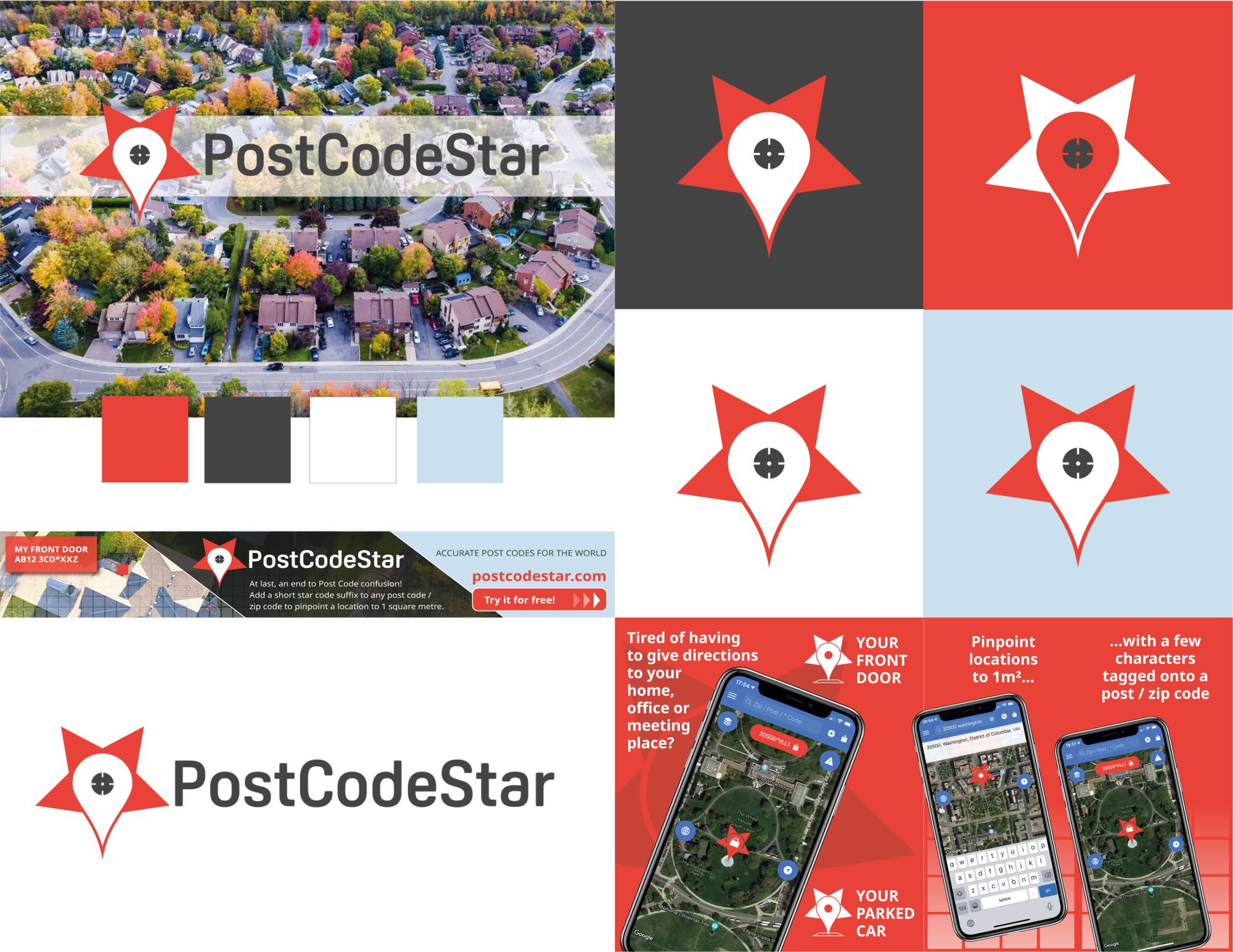
PostCodeStar is a geolocation app, similar to What3words but using a few extra letters or numbers tagged onto a post code preceded by an asterisk (star) instead. A logo was needed that could indicate what PostCodeStar is about, i.e. pinpointing an exact location on a map.
The logo uses the familiar map drop pin icon combine with a star shape and includes a target icon to indicate the fine-tuning of the user’s location to within 1 square metre.
An adaptation of the icon is also used as the drop pin within the app.
Pink Ted also created social media icons and App Store imagery for the launch of PostCodeStar.
A banner advert for Google Adsense was also created by Pink Ted.
If you’d like to chat about how Pink Ted Creative can boost your brand get in touch today.


The PostCodeStar Brand
Icon based on a traditional map pin as used by apps such as Google Maps, enhanced to depict the star from the brand name.
Red chosen as the map pin used in the app itself is red so that it is clearly visible on the map.
Complementary colours leave the red dominant and provide a ‘serious and reliable’ image.
AppStore imagery and Google Ad banners also created for this brand.
