Branding and Website Design & Development
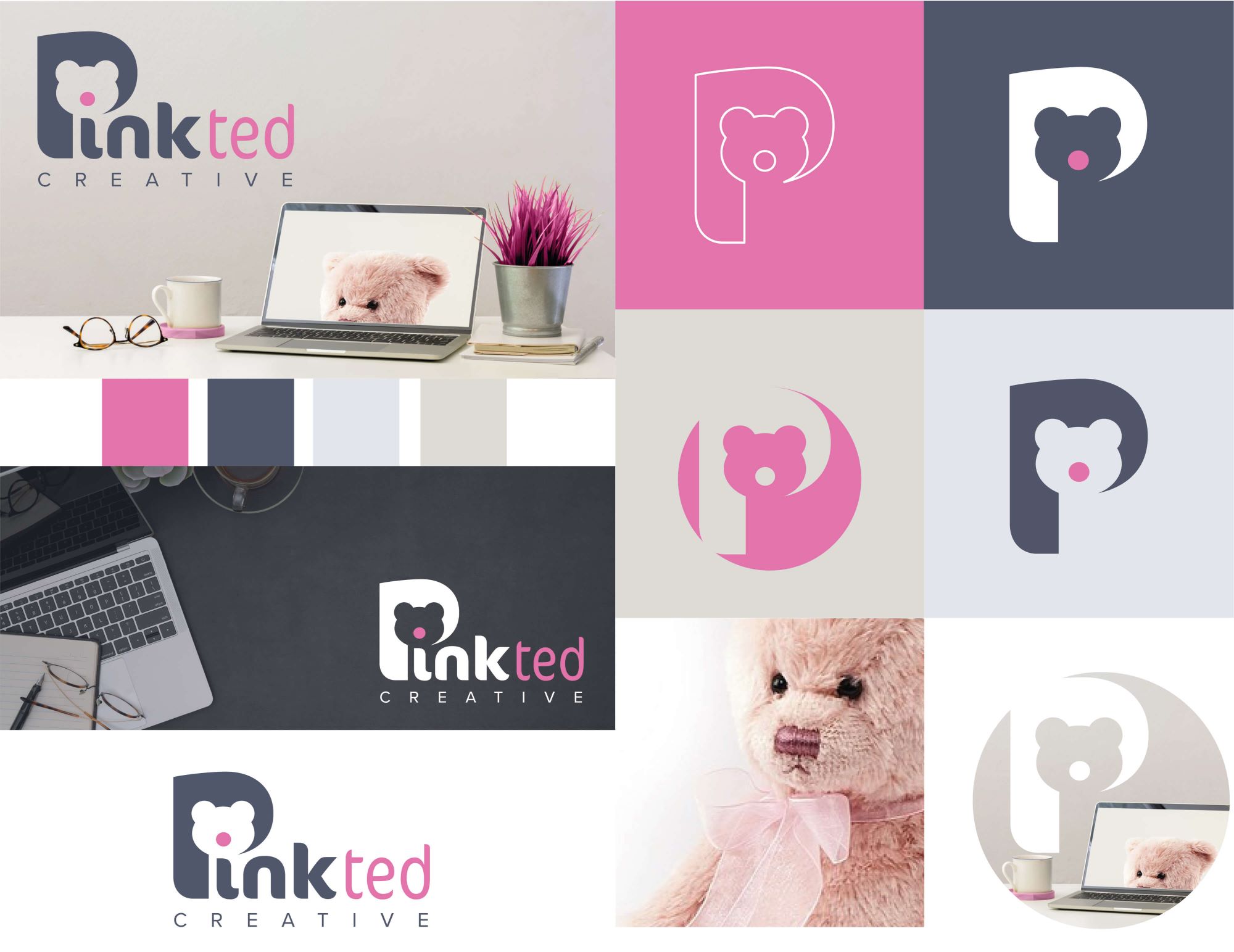
Yes, of course the Pink Ted Creative logo was created by Pink Ted Creative. The brand is professional with an air of quirky fun. It needed to not be outlandishly ‘pink’ and also reflect the creativity of the brand.
The logo uses the shape of a bear head to create the ‘P’ and the dot of the ‘i’ forms the bear’s nose which is coloured pink. The letter ‘P’ on its own is easily recognisable as the brand and is perfect for favicons and social media icons.
The brand also uses the image of a pink teddy bear to add a friendly, fun vibe.
Pink Ted Creative’s website was created on the WordPress platform by, you guessed it, Pink Ted Creative.
If you’d like to chat about how Pink Ted Creative can boost your brand get in touch today.


The Pink Ted Creative Brand
The name Pink Ted was inspired by an early childhood toy that is still around, he’s wise, trustworthy and friendly.
The logo uses a cut-out of the head of a teddy bear to create the letter ‘P’ and it’s nose dots the ‘i’.
The brand is designed to convey the professionalism of the brand whilst showing a cheeky creative edge through the colour, fonts and hinted imagery of a pink teddy.
The logo can be used in a variety of colourways giving versatility and inspiration for social media content.
The glasses used in the imagery are exactly the same as those worn by the business owner so there is a real personal touch here behind the brand.
