Brand Image and Logo Design
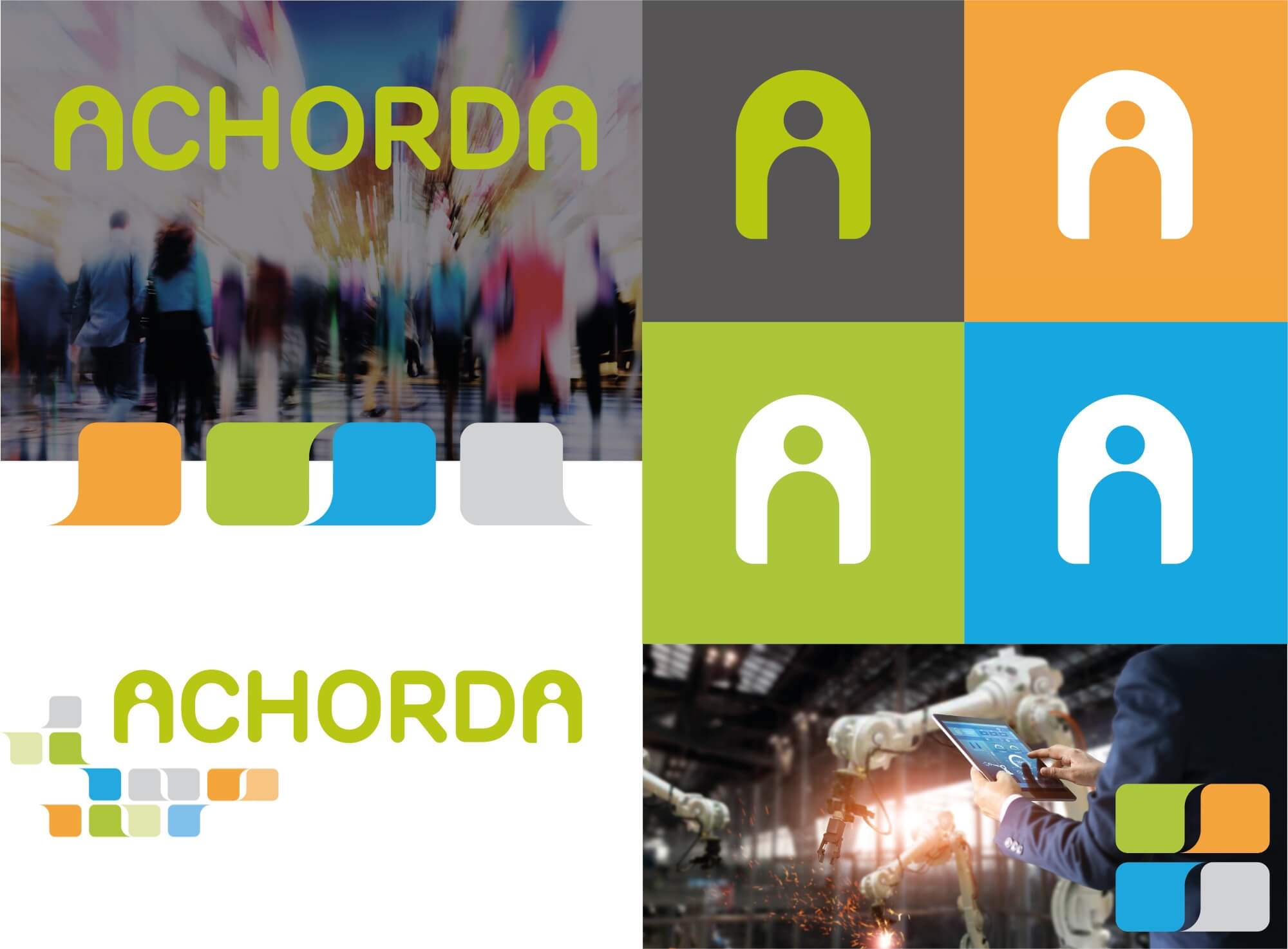
Achorda in Oxfordshire is a niche bespoke software development company. They needed a strong logo that helps express the meaning behind their name in terms of the services they provide. The Achorda brand is about creating unique software solutions for businesses that unites staff, clients and data for more accurate and efficient communication and operations.
The name Achorda plays on the word accord and chord. Accord means ‘in agreement’ or ‘harmony’ which mirrors the goal that the business software is aiming for. Chord is relevant because it’s about different notes working in harmony together, similar to the various departments within an organisation.
The familiar ‘user’ icon is used to form the two A’s, depicting a person at each end of the logo. Between the them is the core of the name held in accord by the two ends. The speech bubbles in complementary colours are used to reflect everyone communicating in harmony resulting in a more efficient business.
If you’d like to chat about how Pink Ted Creative can boost your brand get in touch today.


The Achorda Brand
Cut-out user icon to create the letter A to represent a person/user.
Person at each end is sharing the information between them.
Speech bubbles to reflect the ‘communication and sharing of information’ which Achorda’s software solutions are geared to make more efficient.
Bright complementary colours to reflect the different business operations working in accordance with each other.
